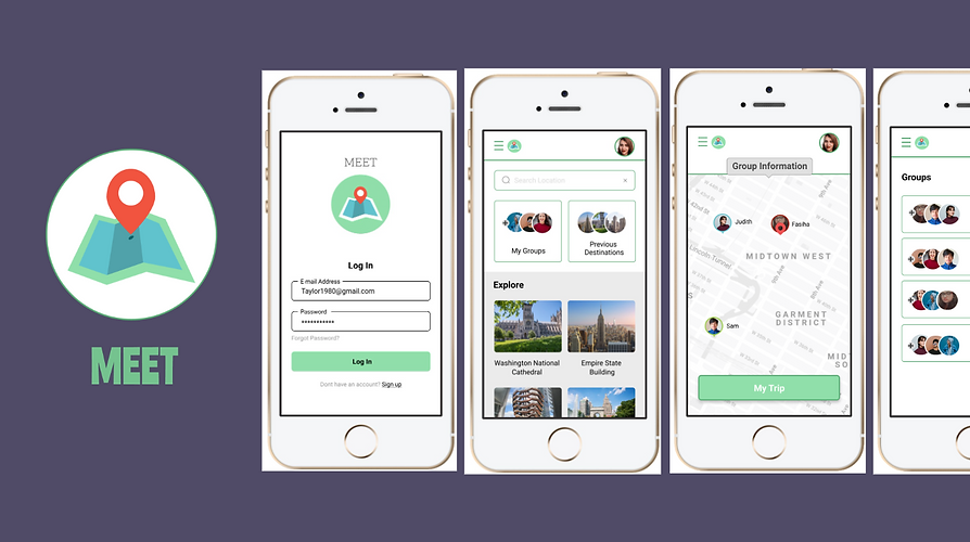
Group Transportation Website
MEET
Meeting up with friends can be annoying, especially when everyone has to take public transportation to reach the chosen destination. And we all have that friend who says their 5 minutes away but is just leaving home. MEET is a website that lets you know where your friend and everyone else is. So next time, the coffee is on the person who arrives late.
My Role
UX Researcher | Designer | Prototype
Team
Judith Valzania, Sam Muktan
Tools
Figma | Miro | Trello

Initial Problem Statement
Hypothesis
Users of public transportation need real time updates and alternatives when navigating through their routes due to constantly changing schedules, delays, and large crowds.
How might we communicate real time updates to public transportation users to help them navigate through changing schedules, delays, and large crowds to ultimately reach their destination?
Research Kickoff
Find Participants
We started our research by running a Screening survey to filter out the potential users of our future product. This helps us to get the most accurate data when interviewing the users and as a result, increasing the need for our product. We broke the survey down to:
1
Screener Questions
Seven questions about transportation and general demographic questions about the participants.
2
Overall Data & Responses
Monitor the results as they came in, to schedule interviews.
3
Ideal Interviewee
Contact those that fit the interview criteria and are potential users of our future product
What Do the Users Want?
Next, we conducted six user interviews with people between the ages of 20 and 29. We asked users specific questions about their experience with public transportation and what frustrations they have while traveling. We crafted each question with thoughtful consideration to encourage interviewees to share as much as possible.
Insights
Apps to Navigate
Users use apps that have popular features to help them navigate to their destiantion.
Speed & Comfort
When traveling users have specific preferences but this changes depending on circumstances.
Pain points
Figuring out travel logistics with a group is an added complication but it's a common occurrence.
Persona
Based on the trends from the user interviews, we created our persona, Taylor. She was a single representation of the key trends we found during the interview process. We used the persona as reference throughout the rest of the research and design phase. Which allows us to design for the right user and if an idea comes to mind, we can ask if it aligned with what Taylor needs and wants?
Taylor

Goals
-
Depending on her day, the option to find the fastest or most convenient route
-
The ability to find alternative ways to get to her destination after last minute changes
-
Knowing how far people really are from their destination
Needs
-
Reliable application to easily navigate last minute changes
-
Accurate real-time updates
-
Easy way to keep up with everyone's ETAs
Pain Points
-
Hates missing stops on the train
-
Unexpected changes in routes disrupts her daily schedule
-
Relies on multiple platforms to coordinate group plans
Taylor's Journey Reaching a Destination
This shows the emotional journey of our target audience “Taylor” and how she interacts with other apps while completing a specific task. It showcased the pain points and highlights while we came across opportunities to help her achieve her goals.

The Situation
Unreliable information, lack of notifications, and delayed real time updates make it difficult to schedule and carry out smooth travel experiences with a group. Because of this, Taylor is not able to reach her destination in an efficient and convenient way, while keeping track of others.
How might we provide Taylor with real time, reliable and accurate information about her and her group's journey to reach their destination in a timely manner?
Potential Features
MOSCOW Map
The MOSCOW Map helps us show the stakeholders why we choose to prioritize these specific features. We prioritized features based on our persona, Taylor. Thus, we focused on features that are important for any public transportation website and created a feature that would differentiate our website from comparators.

Feature Prioritization Matrix
After the MOSCOW Map, we placed the features based on the Y axis (essential and nice to have) and the X axis (high effort and low effort), that is known as the Feature Prioritization Matrix. This allows us to visualize each features value based in the matrix scale.

Insights
Group Collaboration
Plan a destination and the time to meetup with your group members.
Group Travel
Get to see how far everyone in the group is from the destination and see their ETA's
Push Notifications
The ability to notify the group if running late with one simple click
Design Studio
After MOSCOW Map and Feature Prioritization Matrix, we knew what our product will gravitate towards. We started by conducting the first round of design studio to come up with the best solution on how the product will be designed. In the second round, we combined the best ideas on what the screen should include. With the collection of ideas in a design we were ready to mover forward with digitizing the sketches to Mid-Fidelities.
Low-Fi to Mid-Fi
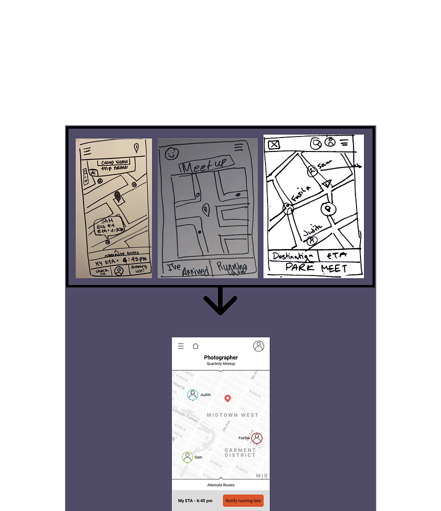
Testing Mid-Fidelity
From the design a studio, we created a digitized version of the final sketch (Mid-Fi) and prototyped it. This way we can test it out with the users to find problems while users are completing a task.
Insights

Users had a hard time understanding that the “Photographers” Group section at the top and the “Alternate Routes” section at the bottom were buttons that had actions attached to them.
Action: Update the tabs to be more similar to a button rather than a swipe up/down functionality, this will help the users get the most functionality out of the tool.
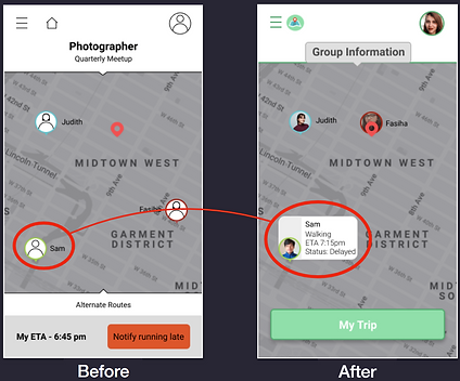
Users found it useful to be able to see all group member’s status at once, however, they usually gravitated to simply clicking on the individual.
Action: Include more information on the individual profiles so the user also has the option to click there to get their status.

When exiting out of a specific users profile on the map, users by nature would first click anywhere else on the screen to go back to the map. It was only on the second or third try most users clicked on the profile again to make it disappear.
Action: Implement the change that matches the behavior of most interviewees, which is to make the entire screen responsive to the action.
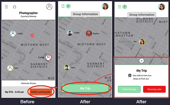
“Notify Running Late” button proved to be distracting and confusing for most interviewees. They believe that functionality should be located in a different area of the interface.
Action: Combine information relating to the user into one area (My ETA, what train/bus they’re on, Running Late button, etc.)
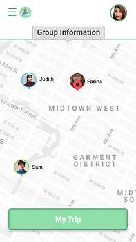
Going Hi-Fidelity


Effects of the New Design
After making the changes to our website in High-Fidelity based on the insights from Mid-Fi testing. We wanted to test the effects of these new changes and how users react to them.

An increase in these areas shows users are taking more time to go through the website.

An increase in easiness rating shows that making changes to the product will lessen the users friction points.
16% increase in success rate shows that users were able to complete the task without any problems.
Future Actions
Based on the multiple iterations and continued improvements between user interviews, we can confidently recommend the continued research and development of this offering.
-
Two more rounds of Usability Testing on the desktop view
-
One more round of Usability Testing on the mobile view
-
Refer to the MOSCOW Map and Feature Prioritization Matrix to reevaluate the order of what features should be implemented and developed next.
